In our interconnected digital age, a business’s website serves as its digital storefront. As 2023 unfolds, it becomes abundantly clear that a company’s web design often stands as the primary touchpoint for potential clients or customers.
With swift advances in technology and shifting user preferences, the importance of staying updated with contemporary design practices cannot be understated. So, what are the best practices in web design for 2023 that businesses should be cognizant of? Let’s explore.
1. Mobile-First Web Design Approach
Mobile devices, to many, are now extensions of our very being. Nestled in pockets and clutched in hands globally, these gadgets have radically redefined content consumption. Data paints a riveting picture: the bulk of digital interactions now occur on mobile. But what truly does a ‘mobile-first’ ethos involve? It transcends merely adapting desktop content for smaller screens. This strategy mandates a holistic reimagining of design principles.
Considerations span touch-centric interfaces, swift load times, collapsible menus, and adaptive visuals. Accommodating varied screen dimensions, device orientations, and platform nuances is crucial. While the emphasis is undeniably on mobile, the traditional desktop interface remains pivotal. The challenge? Crafting a digital ecosystem where both platforms coexist, complementing rather than competing.
2. Intuitive Navigation
If a brand’s online space were a sprawling mansion, its design should ensure that visitors never feel lost. Seamless transition from one section to another, effortless discovery of information, and intuitive touchpoints are the hallmarks of superior design. Every link, icon, or interactive element should be purposefully positioned, guiding the user further into the brand’s narrative.
Features like sticky headers, anchor menus, and predictive search functionalities can elevate user engagement. Furthermore, analytics tools, which monitor user behavior, can offer invaluable insights, enabling businesses to fine-tune their web development strategies and layouts.
3. Use of Dark Mode
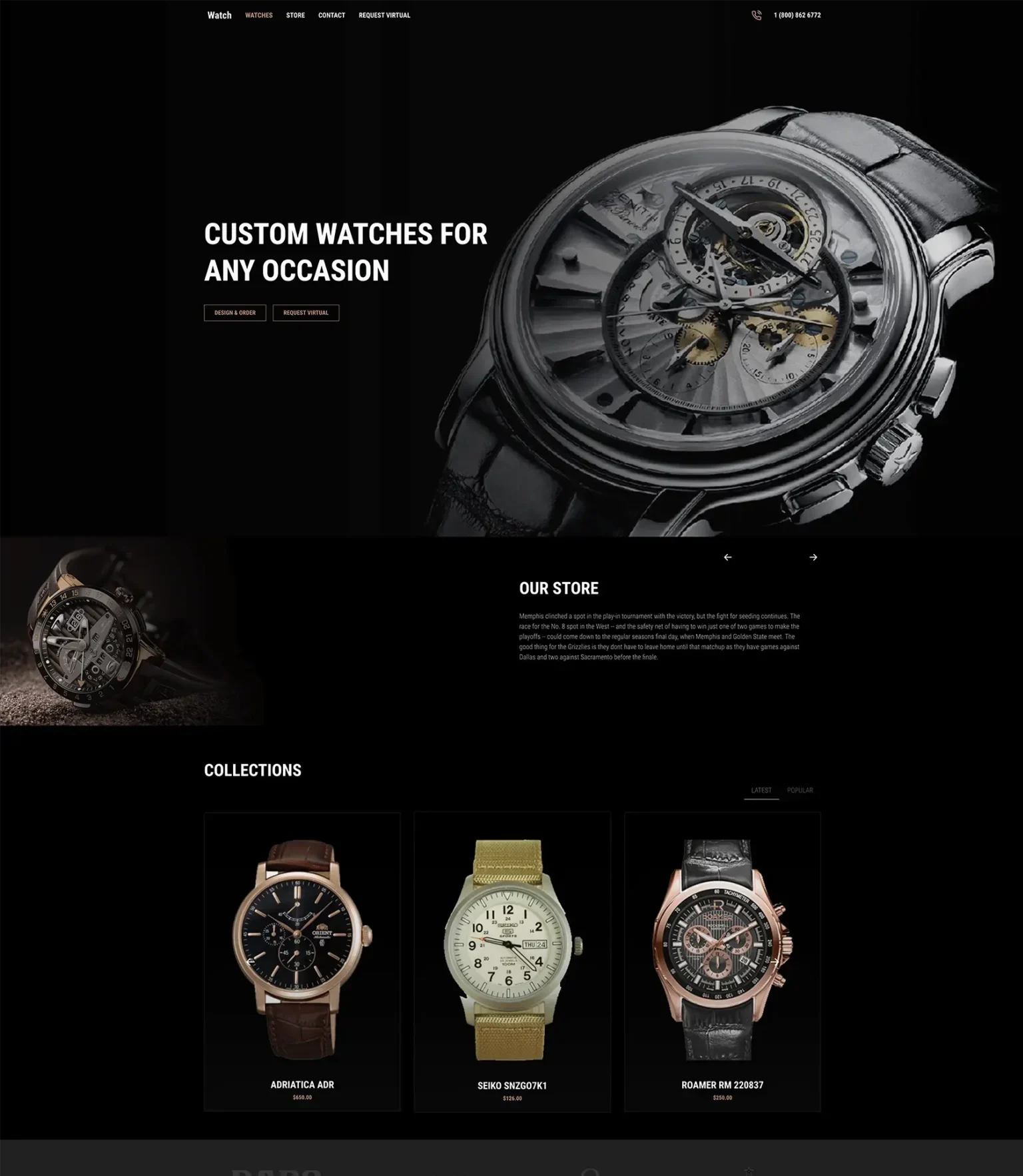
While many design shifts are driven by fleeting trends, the best ones stem from genuine user needs. Dark mode, with its moody and modern aesthetics, caters to both visual appeal and functionality. Beyond just aesthetics, dark mode offers tangible perks. OLED and AMOLED screens, found in many premium devices today, benefit from power conservation when displaying darker themes.
Additionally, reduced blue light emissions make for a more comfortable reading experience in dimly lit environments. Brands that offer users the choice between light and dark themes not only showcase their design versatility but also underscore their commitment to user-centric design.

4. Loading Speed Optimization
In our digital epoch, patience is scarce. Research indicates that even marginal delays in page load times can spike bounce rates. But why is this alacrity so pivotal? Primarily, it’s about retaining user interest. A responsive site retains and engages. Moreover, major search engines, including Google, consider site responsiveness when determining search rankings.
Efficient web development becomes paramount here. This involves streamlined code, multimedia compression, leveraging Content Delivery Networks (CDNs), and prompt server responses. From a frontend perspective, strategies like lazy loading (where elements load as they become visible) can significantly enhance performance.
5. Incorporation of Micro-Interactions
Picturing a digital interface without micro-interactions is akin to envisioning a novel devoid of punctuation. These nuanced design elements, from the tactile feedback of a button to the celebratory animation post a task completion, enrich the user’s digital journey.
They validate actions, offer immediate feedback, and occasionally, entertain. As users navigate a site, these elements keep the experience vibrant and fluid. Beyond their visual charm, they serve pivotal functional roles, offering intuitive cues and simplifying tasks.
6. Consistency in Design Elements
Just as a symphony captivates through coordinated melodies, a website mesmerizes when its design elements sing in unison. Consistency is more than just maintaining a singular color palette or typeface; it’s about echoing a brand’s ethos across every pixel and interaction.
This consistency ensures that users subconsciously recognize patterns, which in turn aids their navigation. From the colors that mirror brand values, fonts that evoke specific emotions, to interactive elements that convey a story, every facet of web design should consistently and coherently broadcast the brand’s voice.
7. Accessible Design for All Users
With the web becoming an integral aspect of modern life, ensuring it’s accessible to all is not just commendable—it’s imperative. Designing for inclusivity means considering diverse user needs, encompassing those with visual, auditory, cognitive, or physical impairments. It’s more than a feature; it’s a responsibility. Be it through prominent color contrasts, effective alt text for images, or facilitating keyboard-only navigation, inclusivity ensures no user feels alienated.
Embracing web accessibility is not just about broadening audience reach; it underscores a brand’s commitment to universal user experiences and can offer significant benefits in web development processes.
8. Integrating AI and Chatbots in Web Development
If earlier web users marveled at animations, today’s users expect seamless interactions with AI-driven entities. Chatbots, leveraging the might of artificial intelligence, aren’t mere reactive tools; they’re proactive digital ambassadors of a brand. These entities, capable of learning and adapting, offer real-time support, addressing queries, and personalizing interactions based on user behavior.
While the underpinnings of these tools are complex, incorporating them into web design is becoming more streamlined. As the realms of AI expand, expect chatbots to evolve from support tools to digital companions, offering insights, recommendations, and personalizing user experiences.
9. Engaging, High-Quality Multimedia
A picture speaks a thousand words—a video, a million perhaps? In the digital space, multimedia elements, be it images, animations, or videos, do more than just beautify; they communicate, engage, and immerse users. However, it’s essential that these elements are contextually relevant, high in quality, and web-optimized.
While stunning visuals captivate, it’s their seamless integration within a site, without compromising load times, that makes them effective. Brands need to strike a balance between quality and efficiency, ensuring these elements accentuate the narrative without hindering performance, a crucial component of web development.
10. Easy Integration with CMS
Behind every vibrant website is an efficient engine, and in many cases, it’s a robust Content Management System (CMS). As the name suggests, a CMS lets brands manage, modify, and monitor content without delving into intricate code. With platforms like WordPress development simplifying this integration, businesses can ensure their content remains agile—refreshed, relevant, and responsive. It’s not just about content updates; it’s about evolving with user expectations, market trends, and technological innovations.
As 2023 unfolds, the fusion of design aesthetics, technological advancements, and user-centric strategies will dictate the digital narratives brands craft. In this transformative era, CoreMeta champions the cause of innovative web design, ensuring clients stay not just relevant but revolutionary. If the digital realm is an ocean, let CoreMeta be the lighthouse guiding businesses towards success. Connect with us, and let’s craft digital masterpieces that resonate, engage, and inspire.


